As answered by Founder + Executive Creative Director of Adjective and Co.
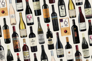
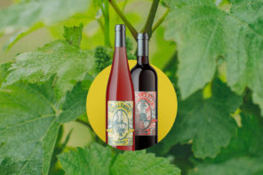
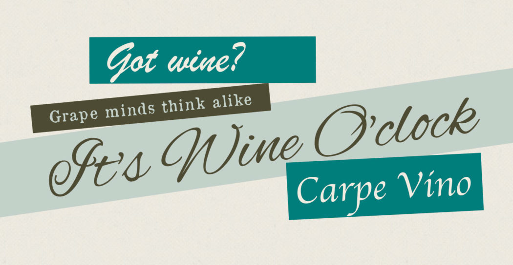
You know it when you see it. A nice little driftwood sign your mom might have over the bar that says “It’s wine o’clock somewhere.” Or when strolling down the aisle of a Home Goods only to be subtly assaulted by the assortment of decorative wine-themed throw pillows, etched wine glasses and, yes, even cat bowls that might say something like “catbernet.” While there are a few different typefaces used for this grapey brick-a-brack, you likely have seen them all. But besides probably a little buzzed, what are these fonts trying to convey?
What pairs well with this typeface?
Nutcracker tickets.
Where would you expect to see this printed?
Olive Garden’s birth certificate.
What is something this type does well for its likely intended audience?
Organizing dinner menus into categories like “Starters” and “From the Grill.”
Where would this typeface go on a family vacation?
Etsy headquarters.
Interesting fact:
It was raised by Uncooked Noodles and Hair as a small child.
What is the most interesting letter?
The lowercase a. I mean q… I mean g. I mean 9.
Does this type believe in kerning?
If Kerning is the name of its imaginary friend who doesn’t believe in kerning, yes.
What pairs well with this typeface?
Stage moms and bubble gum.
Where would you expect to see this printed?
Personalized Pottery Barn Kids lunch boxes.
If this type was an early 2000’s pop act who would it be?
Britney Spears.
What is something this type does well for its likely intended audience?
Trying to be “the perfect mix of sexy and cute.”
Where would this typeface go on a family vacation?
A Carnival cruise.
Does this type believe in kerning?
Yes.

What pairs well with this typeface?
Potpourri.
Where would you expect to see this printed?
GEDs.
If this type was an early 2000’s pop act who would it be?
Hoobastank.
What is something this type does well for its likely intended audience?
Making an $8.99 bottle of wine feel like an $11.99 bottle.
Where would this typeface go on a family vacation?
Sandals: Venice.
Does this type believe in kerning?
If you’re an over-caffeinated pastry chef writing in icing on a cake, yes.
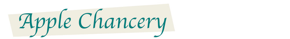
What pairs well with this typeface?
Nametags and buffets.
Where would you expect to see this printed?
In-room anniversary cards from hotel managers accompanied by unsanitary chocolate-covered strawberries.
What is something this type does well for its likely intended audience?
Making insignificant achievements feel appropriately insignificant.
Where would this typeface go on a family vacation?
An Apple Chancery.
What is the most interesting letter?
Capital F.
Does this type believe in kerning?
Kerning, no. Wonky x-heights and gangly baselines, yes.

What pairs well with this typeface?
Celibacy
Where would you expect to see this printed?
Custom wedding napkins (in gold foil).
What is the most interesting letter?
Although the capital “W” huffed gas as a child, it seems to have finally gotten its act together and can stand up without falling over.
What is something this type does well for its likely intended audience?
Inviting them for Tab and cheese in the lobby after the funeral.
Where would this typeface go on a family vacation?
Downton Abbey.
Does this type believe in kerning?
Yes, until Electric Slide hits the dance floor.