
A quick, not comprehensive, list of ways to improve your photo skills.
Witten by Brittany Norris
Odds are good not everyone reaching this page is an experienced photographer. Some of us will never be in a studio, fussing with strobe lights and taking readings by the light meter. But many of us will play Instagram photographer for our friends and family. And some of those photos will find their way onto our refrigerators because our mothers think photo magnets make for good stocking stuffers. (She’s not wrong.) So for the sake of scrapbook fridges, here are a few tips to elevate your picture-taking skills.
Clean your lens.
Leave the lens flare to JJ Abrams and keep your equipment clean. Smartphones and cameras alike could use a little TLC. Invest in some good microfiber cleaning cloths and remove the smudges.
Move around.
As mentioned before, the days of limited shots based on your roll of film are … gone. Don’t hesitate to take a bunch of photos of your subject from different angles. Get high and low. Maybe try a few up close and some from far away. And while you’re at it, mess around with the exposure settings too.
Explore depth of field.
This term refers to how much of your photograph is in focus. Whatever the subject, there will be distance in front and behind and some of that will remain sharp. In portraits, the person stays sharp in the foreground and the background is often left soft and unfocused, creating a blur called the bokeh effect. Whereas the opposite takes place with landscape photos, where the goal is generally to keep as much of the foreground and background in focus and as sharp as possible.
Know the resolution.
This applies primarily to digital photography and it refers to the number of pixels within an image. The higher the resolution, the more pixels, the more details. The measurement is given in pixels per inch (PPI) or dots per inch (DPI) (dots refers to the tiny droplets of ink created in printing). “High resolution” is a common term and doesn’t refer to a specific number, but generally means 300 PPI or more, which allows for quality reproduction in the final use (think framed print or magazine layout).
Practice the rule of thirds.
Imagine two lines running horizontally across your image and then two more running vertically. (Some viewfinders and smartphones will have this grid already in place.) Play around with moving the subject of your photo off-center to align with either a vertical column or horizontal row and leave the other two-thirds of the shot open. This will create interest in the composition and draw the viewer’s eye throughout the whole image.
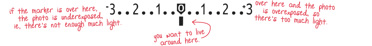
Learn the exposure triangle.
Photography is the practice of capturing light and the exposure triangle is a combination of three variables, available on most cameras and maybe some smartphones, that controls that action. (The term “expose” comes from ye olden days when light-sensitive film was exposed to light via the camera and an impression was made. Wild how times have changed.) Please note, the relationship between these three varies on how you adjust each one. Super brief overview below (best accessed in manual mode).
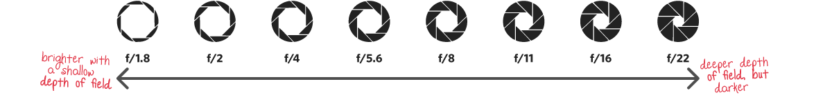
Aperture
Simply put, this is the size of the lens opening. The wider it is, the more light allowed in. Smaller openings mean less light. And it’s all measured in f-stops. It’ll feel a little strange because the smaller the number, the wider the opening. For example, f/1.8 is wide and f/22 is narrow. The setting also affects the focal length of the shot. Small f-stops result in a shorter depth of field and unfocused backgrounds while large ones keep more of the foreground and background sharp.
Shutter Speed
We’ve set the size of the aperture with the f-stop, but how long do we leave it open to capture the photo? That’s called shutter speed. It’s displayed in fractions of a second, or seconds, on your camera (1/800 or 2s). The longer the shutter is open, the more light gets in. Trying to capture the night sky? You might be leaving the shutter open for 30 seconds or more. You’ll also need a tripod—for shutter speeds lower than 1/60, it’s good to stabilize the camera with something other than your hand.

ISO
This setting determines how sensitive the camera is to light. The lower the number, the less sensitive. The higher, the more sensitive. For shooting in full daylight, you’ll live closer to an ISO of 100. Is it super dark? Try 3200. But know there’s a trade-off here. The higher the number, the grainier and less detailed the final result will be. Aim to use the lowest ISO possible for the situation.
