
How To Replace Beige With Brilliance

With any kind of personal style, everyone has their own taste, preference and perspective. Especially when it comes to designing and decorating the inside of your home or office or wherever you might spend a good amount of your time. Taking things like Feng Shui, natural light and trying to match the feel of the room with your new, karate-chopped decorative pillows into consideration.
Lately, the tans, the browns and everything being white or variant hues of the same earth tones have seemed to take over interiors. So what happens when you decide you want to add a little pop of color? Or a couple pops and some patterns … maybe texture. Neon lights?
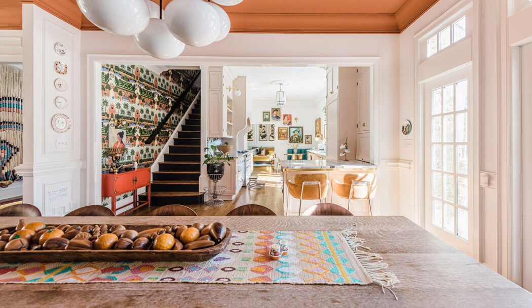
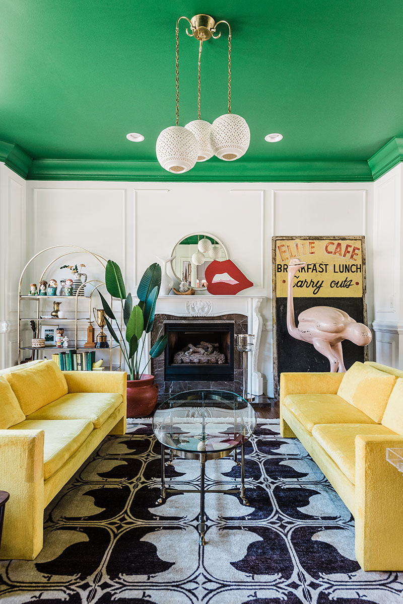
Blank walls can be intimidating. But interior designers like Natalie Papier know how to bring more color to the scene. Well, more color, patterns, vibrancy, pop. Something a little more on the maximalist side of the instagrammable-space spectrum. So instead of buying another wicker basket, here are some tips on how to add a little bit of spice and spontaneity to your space. From a professional, of course.
How should vibrant design make someone feel?
Natalie Papier: Vibrant designs should make you feel alive! Surrounding yourself with an atmosphere that brings out your most authentic self with pieces that reflect you and all aspects of your personality is key to a joyful, vibrant space.
Best tip for adding a pop of color to a room for someone trying to move away from beige?
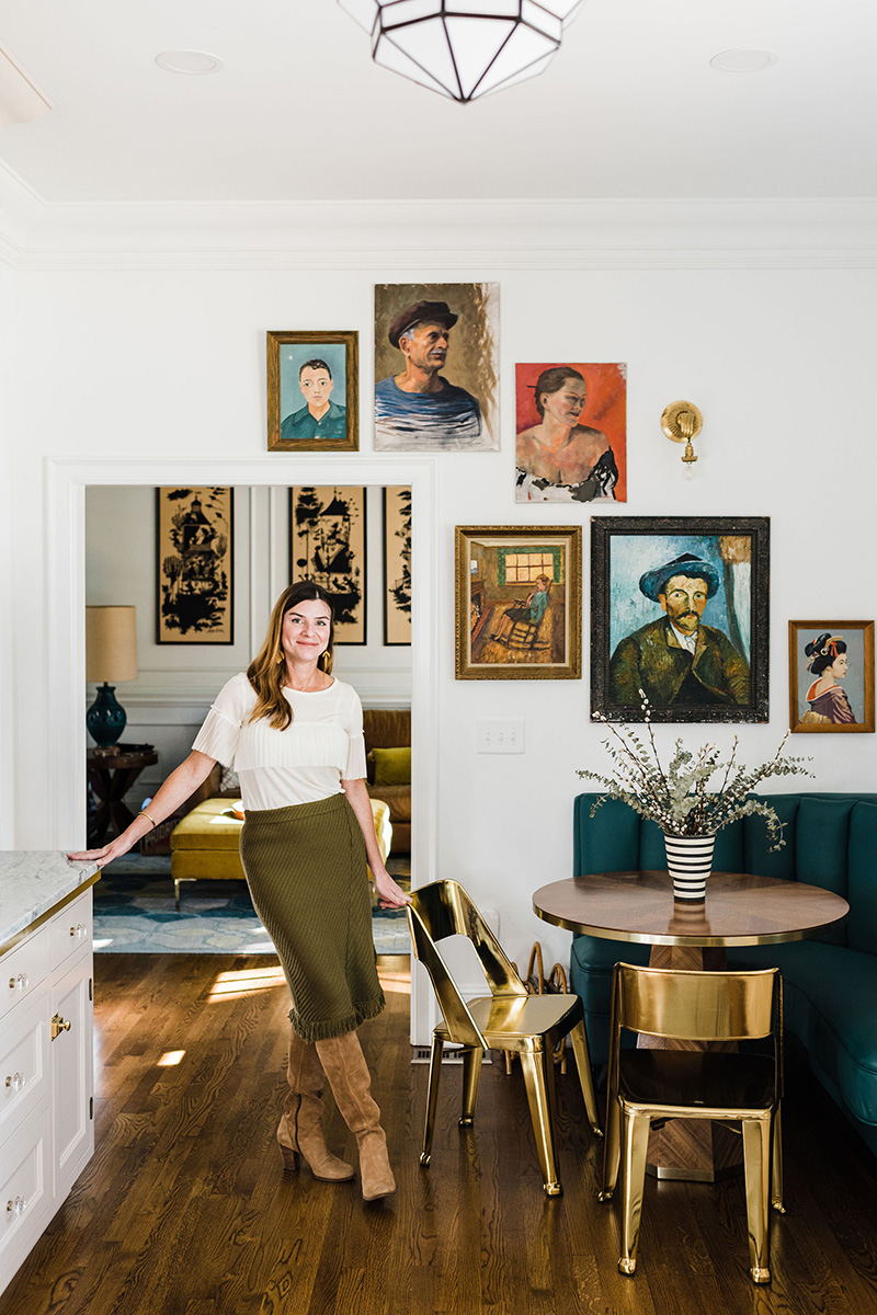
NP: There are so many little ways to incorporate color in your space. Start with some colorful throw pillows or a rug with saturated color to complement the existing neutrals in the room. Art is always a fantastic way to add color, interest and soul into a design.
Your most passionate rebuttal to “less is more.”
NP: That’s a saying that has never made sense to me. If you take that concept into life, less is not even close to enough. We all want to experience more of what life has to offer. Your home is a place that should encompass your big, full life and if your life is blank white walls and neutral furniture, I’m not sure what that says about you exactly. Where’s the life? Where is the soul? The creativity? The personality? I do think there is a way to have high design with maximalism tendencies. But like all things in life, it’s all in the balance.
Best tip for incorporating a pattern into your space?
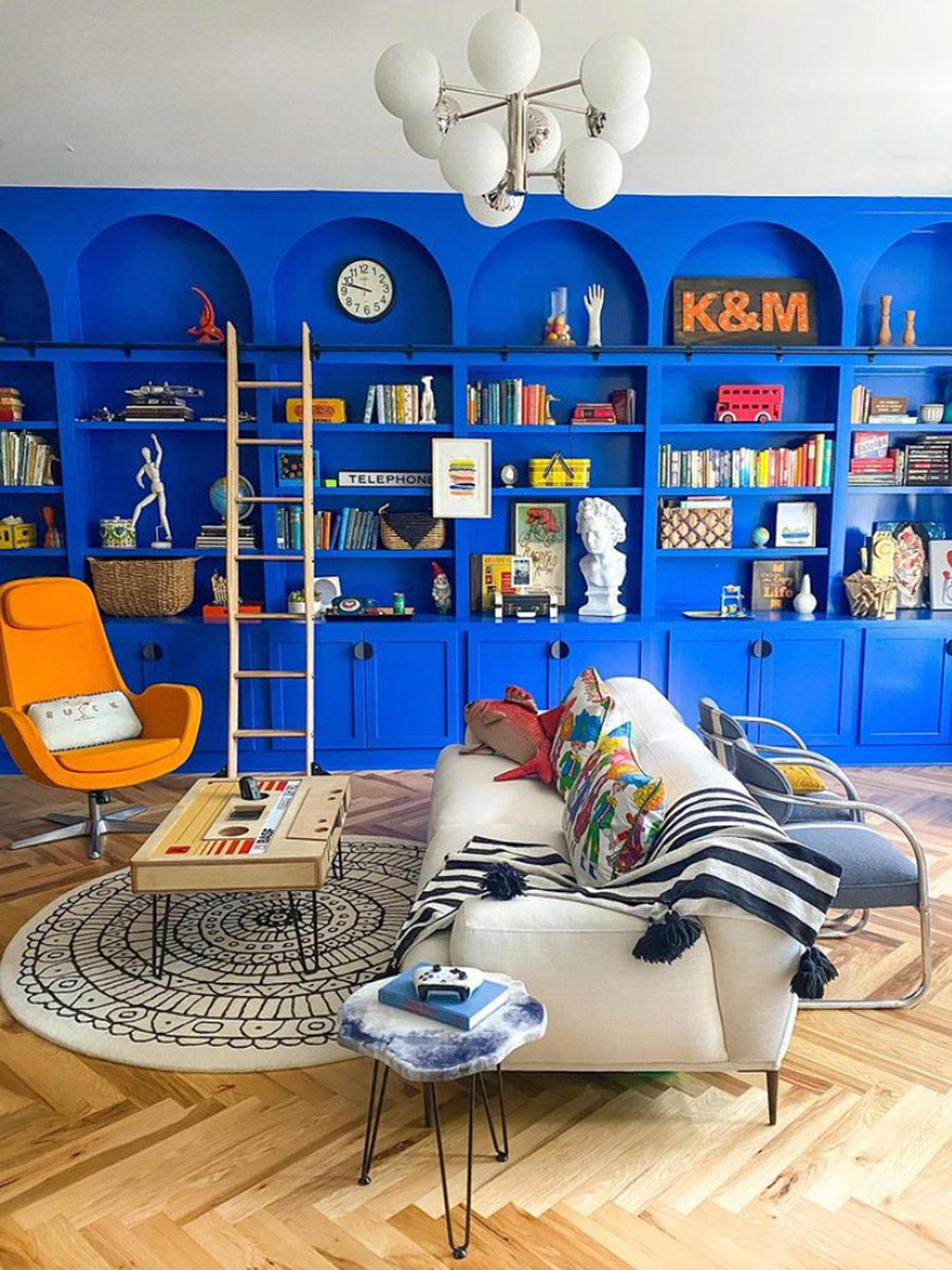
NP: I love love love pattern mixing. The trick is to balance the scale and color palettes in patterns. Balance a busier, small pattern with a larger pattern. Add in some solid pieces to provide a rest to the eye and to let your pattern moment shine.
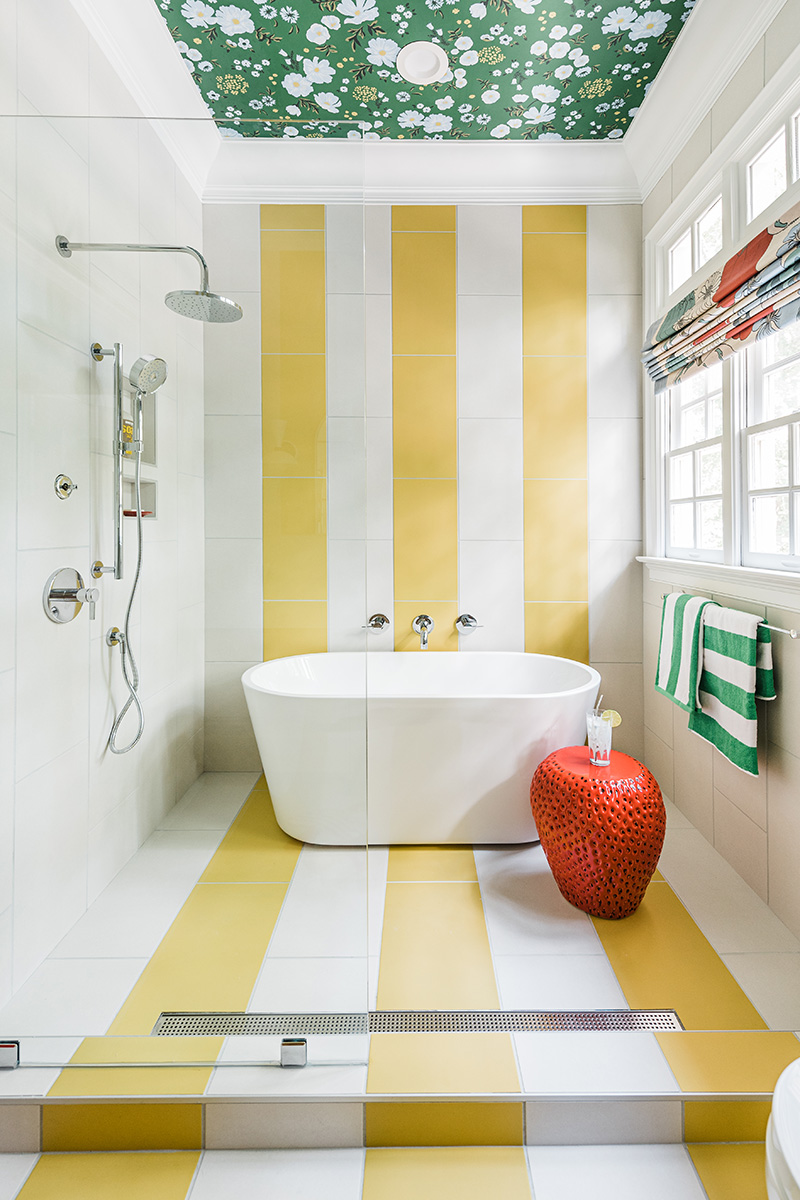
Best advice for designing around printed wallpaper?
NP: Printed wallpaper with a repeat pattern is a statement in and of itself. If you want that to be the main feature of the room design, keep the rest of the space unfussy. But I love adding art and/or mirrors over wallpaper for a more interesting, layered approach for a more maximalist space.
Rules are meant to be broken.
Top three things to remember when trying to design with bright colors and patterns?
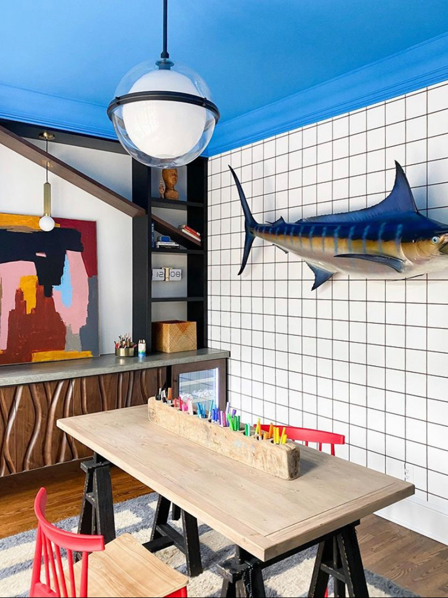
NP: The one thing I always recommend with paint (no matter how bold you are planning to go) is to get full page sample sheets or paint a poster board with a sample pint to see how the color works in your space. Lighting differs in every home and can make a huge difference in how the color reads. But after that? I don’t have many rules to throw at you here. Rules are meant to be broken. But if you want a good rule of thumb to follow, it should be about keeping your color palette relatively consistent in order to create harmony and consistency. I also love incorporating warm woods and black and white accents that act as my neutrals to accent my bold color choices.
You walk into an empty room with blank walls. First place you start to bring the room together?
NP: In a blank space with nothing to start from, I always start with color as my inspiration. I love walking around with my pockets full of paint samples. Sitting with them in the space, something usually grabs me. And then it’s like … let the games begin.